

Storyline was developed to help users test their knowledge of historical trends. In doing so, we can learn something about people’s assumptions.
Storyline partnered with Brigham Young University (BYU), in Provo, Utah. Nearly 3,000 undergrad students played Storyline as part of a US history class. Try out the quiz here.
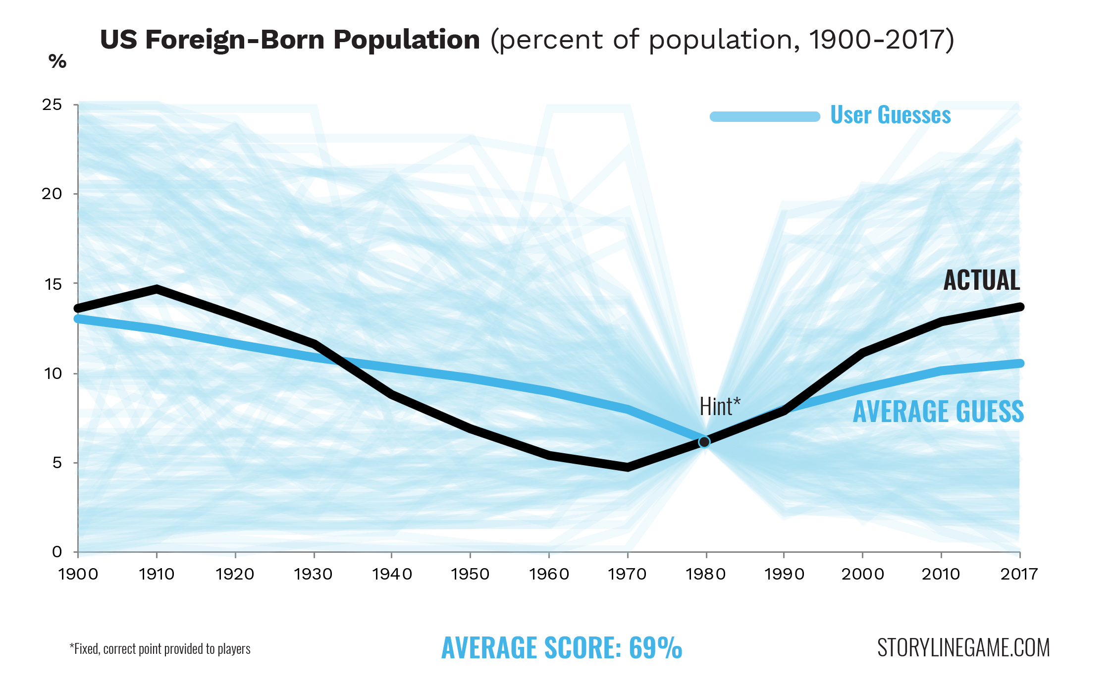
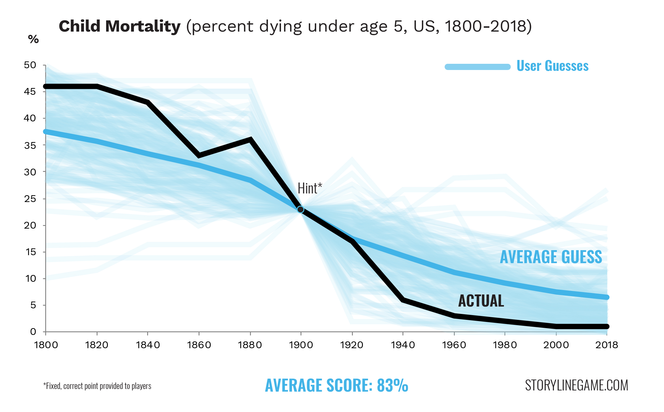
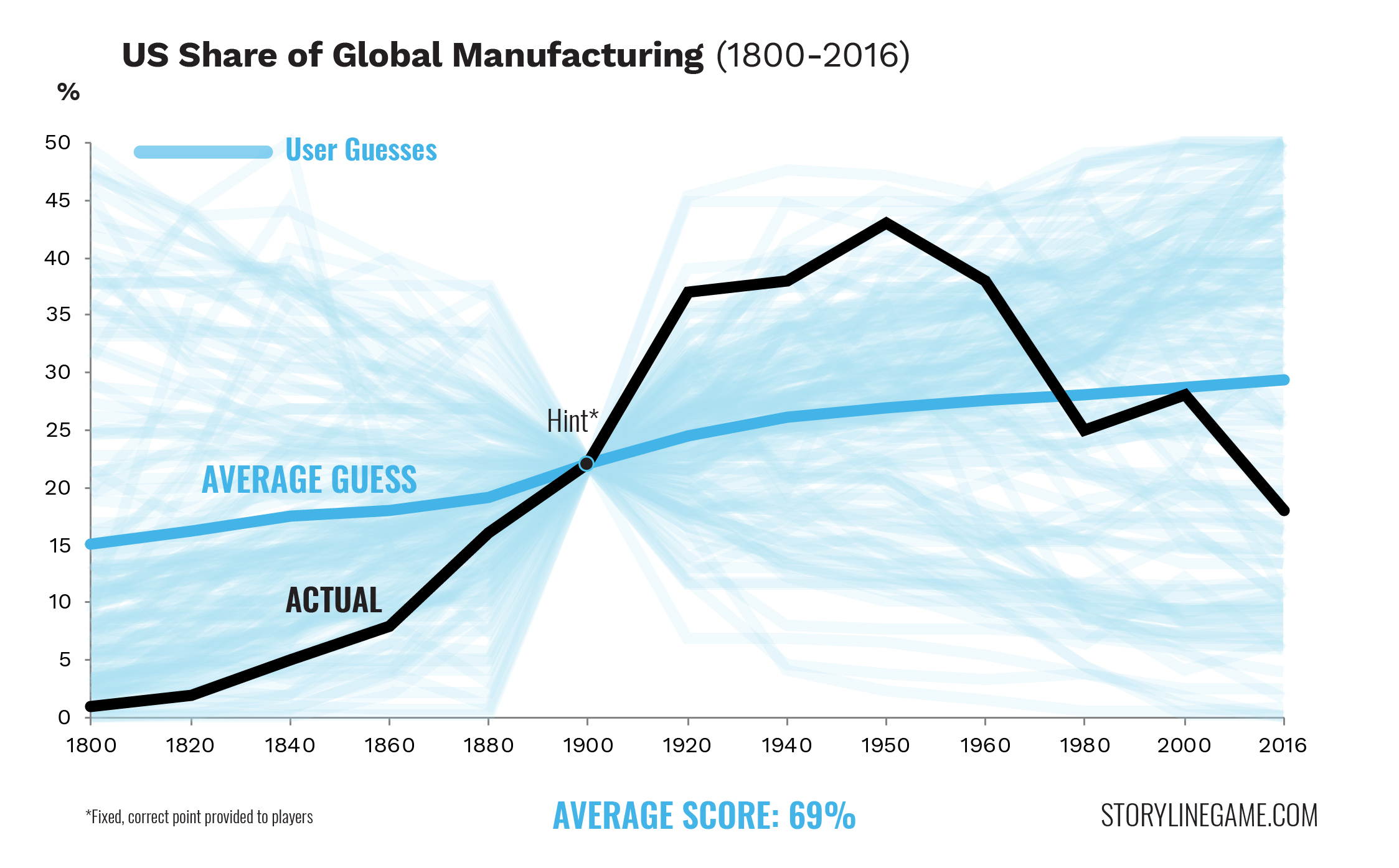
The results are visualized below. To make the chart easier to interpret, only 200 hundred results are plotted.
The next step might be to have a scientific survey conducted, in which a representative sample would play Storyline. We could then evaluate how different demographics (age, gender, political orientation) hold different assumptions about trends. Let us know what you think here.


About The Author: Olivier
Olivier has long been fascinated by historical trends and data visualization. Born and raised in Quebec, he obtained his master's from the London School of Economics. He works as a designer in Washington, DC.
More posts by Olivier